October 2025
- Oct 30, 2025
- 5 min read
Always judge a book by its cover.
A while back, my mom invited us for dinner. I live one minute away from her (yes, that’s by design) so dinner invitations happen more often than not.
Since I have three toddlers, we usually let them eat first so we may eat in peace.
After my five-year-old son had finished up, we went to the bathroom to clean his hands. My fancy mom had two types of soap: strawberry and olive.
I grabbed the strawberry soap (as any sane person would), but as I was about to pump the soap onto my son’s hand, he pulled it away.
“I want that soap,” he said and pointed at the olive soap.
“Son, this one has a strawberry scent,” I replied.
“I want that soap!” he said again, pointing at the olive soap.
I was too hungry to fight, and besides, who cares what soap he washes his hands with.
Later that evening, I couldn’t stop thinking about it.
Why did my son prefer the olive soap over the strawberry one? If anything, he likes strawberries more than olives.
Then it struck me, he picked the olive soap because it was better designed.
I smiled.
As human beings, we are wired to make quick judgements about people, environments, situations, and yes, soap dispensers.
Judging someone’s or something’s appearance on autopilot isn’t shallow—it’s human.
Our brains are constantly processing micro-expressions, posture, color, symmetry—basically all visual cues that could indicate reliability or danger.
This automatic assessment, which helped our ancestors survive in the savanna, is called thin-slicing.
And it’s 100% applicable to products too, not least of all books.
A poorly designed product may reveal a lack of care. A well-crafted one may indicate the effort and attention that went into its contents.
That’s why my son chose the olive soap (I forgot to take a photo of the soap dispensers, but the olive one looked more fresh and premium).
Now that we can agree on the importance of first impressions, let me explain why it’s so damn hard to design the cover for Table of Gods—and why I’ve spent the better part of October working on it.
The complexity of designing Table of Gods
Most books are designed in 2D. A graphic designer creates the cover and interior pages using programs like Adobe Photoshop, Illustrator, and InDesign.
Once the author and publisher have approved it, the publisher sends the design files to a printer that uses their “house paper” to print the book in a standardized format.
Everyone knows what to expect and the outcome is reliable.
But designing Table of Gods is more like designing a car than a typical book.
Let me explain.
Since 2019, I’ve changed designers three times because they didn’t meet my standards.
But I didn’t realize why until I learned the difference between graphic designers and industrial designers.
The designers I chose in the past were graphic designers used to working in 2D. Books usually fall under this category.
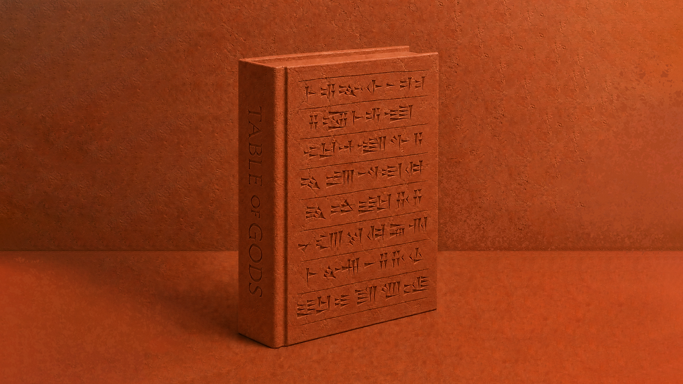
But ever since I decided Table of Gods should resemble a clay tablet, the design entered the world of 3D—which is the work of industrial designers (people who design cars).

A clay tablet from southern Mesopotamia, circa 1900 BC (now at Yale University). This tablet holds 25 of the world’s oldest recipes. The tablet is three dimensional, not only because a tablet is never flat, but because the inscribed cuneiform is pressed into the surface.
The challenge of manufacturing a book that resembles a clay tablet with impressed cuneiform signs is that books are made from paper. And paper is fragile.
You probably have a hardback book with a debossed (pushed down) typeface or logotype on the cover. Those are usually pushed down 0.3 mm.
If you push further, the paper tears.
I could obviously use this standard 0.3 mm method for debossing the cuneiform signs on my cover and the design would be done.
After all, this is how debossing on books has been done for decades.
No one would criticize me for it, because there’s nothing to compare it to. You’d still feel the cuneiform signs pushed down on the cover, and you’d probably think it was really good.
But really good isn’t good enough for me. Only extraordinary is.
If I settled for really good, Table of Gods would’ve been published long ago—or maybe not at all, since I wouldn’t be motivated to make a cookbook like every other to begin with.
I’ve always been an “all in or nothing” person (which is why I quit my day job in 2021 and have invested all my savings into Table of Gods).
I like to innovate and do things that have never been done before—especially when people tell me it’s impossible, as some have said about my cover.

Here’s a mockup of what I’m trying to achieve with the cover. Note the paper’s texture and the depth of the cuneiform signs. But remember, crafting a beautiful cover on a screen is one thing—creating it in the real world is another.
To craft a cover like the one above, I need four things.
1. Covering paper that can withstand deep debossing and has a surface resembling clay
2. A 3D designer
3. A brass die
4. A printer
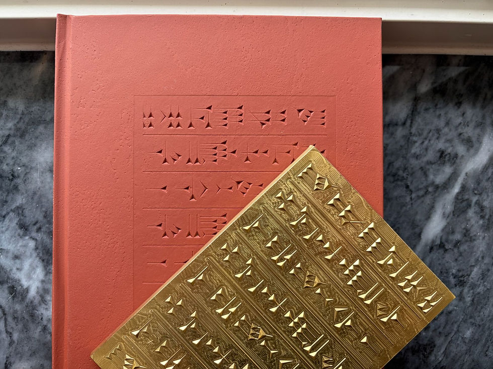
A brass die is a custom-made metal plate engraved with the cuneiform signs I want to appear on the cover—taken directly from the 4,000-year-old tablet with the world’s oldest recipes.
The printer presses it against the covering paper to create a precise impression of the design. This process shapes the paper surface, forming the cuneiform signs through pressure (debossing).
And here’s where we step into the world of 3D.
To make the cuneiform signs on the cover feel authentic, they can’t be pressed straight down with vertical walls. Each sign needs to slope gradually toward its deepest point.
This sloping is achieved in the engraving of the brass die itself. Instead of engraving flat-bottomed, vertical-sided cavities, a 3D artist sculpts each cuneiform sign with angled walls and varying depths that mimic real cuneiform tablets.
If I sound like an expert, I’m not.
I’m just a child who doesn’t know his limitations, driving paper mills and printers crazy. But some have realized I’m not just insane.
Here are excerpts from two emails I received today, unedited.
Printer 1: “We can see you have devoted so much effort into this great book project, it is such a great work, and we truly hope we can assist you on this book’s development!”
Printer 2: “It’s fascinating to follow how you keep refining the concept. The depth and authenticity you’re aiming for truly match the essence of Table of Gods.”
I used to play soccer as a teenager. And one day, after a game, my youngest sister approached me and asked about the result.
“We lost,” I said.
“Did you do your best?” she asked.
I didn’t reply.
I’ve increased the stakes by revealing my cover vision for you. There’s a great chance science makes it impossible to pull off. After all, paper is paper.
But I have no problem failing publicly while reaching for my goals. The only thing I’m afraid of is falling silent when someone asks, “Did you do your best?”
In November, I’ll travel to Italy to meet several paper mills and printers in an attempt to find a solution to achieve my vision for the cover.
In the meantime, you can follow me on Instagram for more updates.